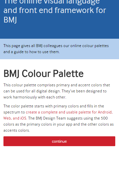
BMJ Colour Palette
This colour palette comprises primary and accent colors that can be used for all digital design. They’ve been designed to work harmoniously with each other.
The color palette starts with primary colors and fills in the spectrum to create a complete and usable palette for Android, Web, and iOS. The BMJ Design Team suggests using the 500 colors as the primary colors in your app and the other colors as accents colors.
NOTE: The font colour depicted in the palettes below MUST be followed in order to make content accessible
Primary Colour Palette
- BMJ Blue 500 #2a6ebb
- #f2f7fc
- 100#b4cfee
- 500#2a6ebb
- 700#1f5189
- BMJ Grey 500 #747678
- #fbfbfb
- 100#d4d4d5
- 500#747678
- 700#565759
- Dark Grey (Black subsitute)#333333
- #ffffff
Secondary/Accent Colours
- BMJ Yellow 500 #f0ab00
- #fffefa
- 100#ffe8ae
- 500#f0ab00
- 700#b37f00
- BMJ Orange 500 #e37222
- #ffffff
- 100#f8ddc9
- 500#e37222
- 700#b15716
- BMJ Red 500 #CD202C
- #FEF8F9
- 100#F4B6BA
- 500#CD202C
- 700#981821
- BMJ Pink 500 #c50084
- #ffcfef
- 100#ff83d6
- 500#c50084
- 700#88005b
- BMJ Purple 500 #7d5cc6
- #ffffff
- 100#ece8f7
- 500#7d5cc6
- 700#5e3baa
- BMJ Aqua 500 #00b2a9
- #bcfffc
- 100#70fff8
- 500#00b2a9
- 700#00756f
- BMJ Green 500 #69be28
- #f7fcf3
- 100#cdefb4
- 500#69be28
- 700#4d8b1d
UI color application
Choose your palette
You should always use the BMJ Blue (#2A6EBB) for the main nav and footer of your app.
Limit your selection of colors by choosing two hues from the primary palette and one accent color from the secondary palette.
- BMJ Blue 500 #2a6ebb
- 100#b4cfee
- 700#1f5189
- BMJ Purple700#5e3baa
Example of a color palette using the 2 hues of BMJ Primary blue from the primary palette and one accent BMJ purple hue.
Primary color - BMJ Blue
When using a primary color in your palette, this color should be the most widely used across all screens and components.
- BMJ Blue 500 #2a6ebb
- 100#b4cfee
- 700#1f5189
Example of a primary color palette with variations for when a darker or lighter version of the color is needed
Accent colour
Colours from the secondary color palette may be used to indicate a related action or information as well as used as an accent colour.
The accent should be used for the floating action button and interactive elements, such as:
- Text fields and cursors
- Text selection
- Progress bars
- Selection controls, buttons, and sliders
- Links
- Icons/page decoration
- BMJ Red 500 #CD202C
Heads up!
More detail in how to use the BMJ colour palette is coming soon!